
類似的外觀,編寫時不斷的重複貼上,未來有修改時,難免東漏西漏,這時候Style就能解決你的煩惱~
最近工作開始大刀闊斧的使用WPF畫UI,一些以前用過的方法都快忘光了,趁這次複習整理起來做一篇UI必用的Style介紹
基礎使用
WPF的Style類似網頁的CSS,可以預先定義好整組樣式,指定key值,接著把控制元件的Style屬性指到該key,就直接套用了,話不多說,來看看範例
<Grid>
    <StackPanel Margin="10">
        <TextBlock FontSize="20" Margin="10" Text="文字一"/>
        <TextBlock FontSize="20" Margin="10" Foreground="BlueViolet" Text="文字二"/>
        <TextBlock FontSize="20" Margin="10" Text="文字三"/>
    </StackPanel>
</Grid>
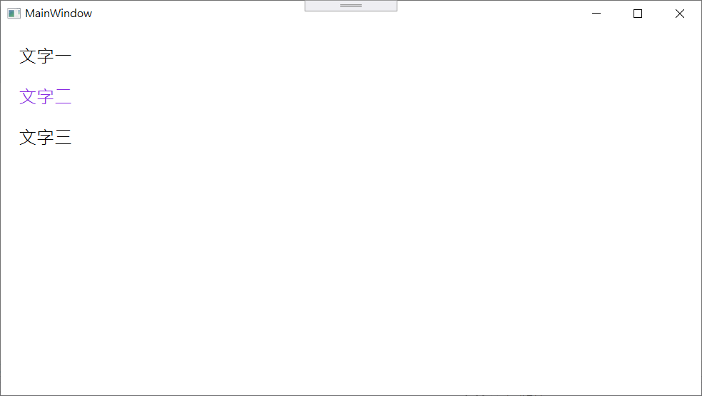
可以看到有三行文字,大小一樣,但顏色不同,每行文字的樣式都是個別定義,但如果今天需要修改文字大小或Margin時,就得改三次,如果量大,難保出紕漏,因此將相同的屬性抽出來,減少重工
<Window.Resources>
    <Style x:Key="NormalText" TargetType="TextBlock">
        <Setter Property="FontSize" Value="20" />
        <Setter Property="Margin" Value="10" />
    </Style>
</Window.Resources>
<Grid>
    <StackPanel Margin="10">
        <TextBlock Style="{StaticResource NormalText}" Text="文字一"/>
        <TextBlock Style="{StaticResource NormalText}" Foreground="BlueViolet" Text="文字二"/>
        <TextBlock Style="{StaticResource NormalText}" Text="文字三"/>
    </StackPanel>
</Grid>
可以看到重複的屬性減少了,更好維護,未來如果要改文字大小,只要改Style即可。
多層嵌套
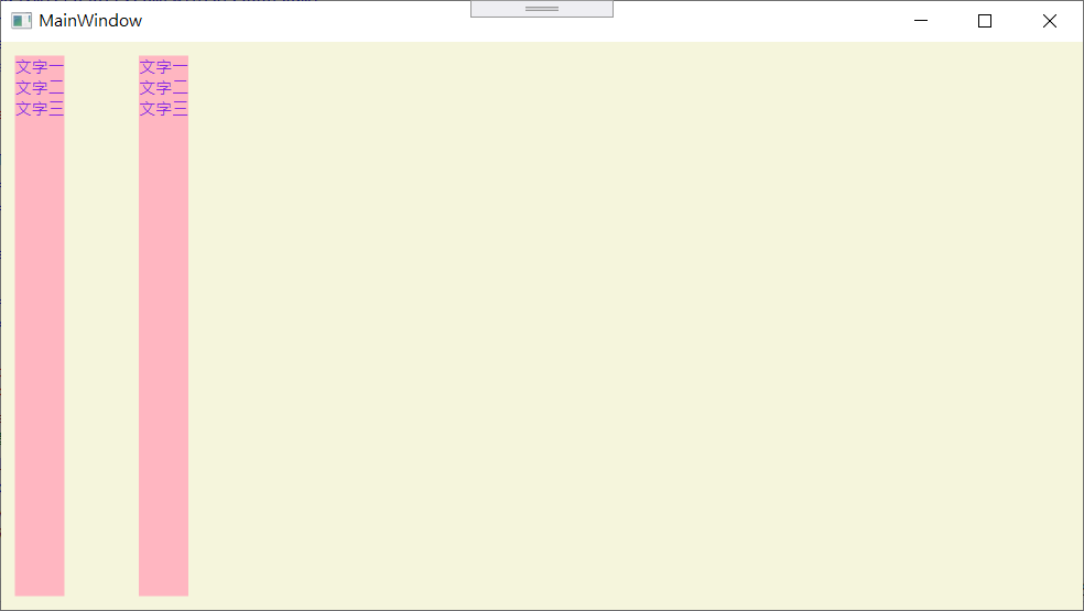
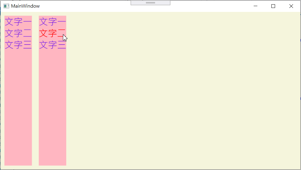
有時候我們的UI較為複雜,不只單層,而是有多層嵌套,例如Grid內有StackPanel,StackPanel內還有TextBlock,那我們可以寫一個Style就套用到底下2層嗎?答案是肯定的~
<Grid>
    <StackPanel HorizontalAlignment="Left" Margin="10">
        <TextBlock Text="文字一"/>
        <TextBlock Text="文字二"/>
        <TextBlock Text="文字三"/>
    </StackPanel>
    <StackPanel HorizontalAlignment="Left" Margin="100 10 10 10">
        <TextBlock Text="文字一"/>
        <TextBlock Text="文字二"/>
        <TextBlock Text="文字三"/>
    </StackPanel>
</Grid>
<Window.Resources>
    <Style x:Key="MultiLevel" TargetType="Grid">
        <!--第1層-->
        <Setter Property="Background" Value="Beige" />
        <Style.Resources>
            <!--第2層-->
            <Style TargetType="StackPanel">
                <Setter Property="Background" Value="LightPink" />
                <Style.Resources>
                    <!--第3層-->
                    <Style TargetType="TextBlock">
                        <Setter Property="Foreground" Value="BlueViolet"/>
                    </Style>
                </Style.Resources>
            </Style>
        </Style.Resources>
    </Style>
</Window.Resources>
效果如圖:
定義常數
介面上因為風格相同,有許多是值都會是一樣的,可能是文字大小、寬度或者是顏色等,但在定義xaml或style時,卻可能打好幾次相同的值,萬一後來客戶說字小一點,某的顏色不喜歡都換成另一個顏色,同樣又面臨到重複修改,可能遺漏的問題了。
首先,再Window上加上命名空間xmlns:sys="clr-namespace:System;assembly=mscorlib"
<Window x:Class="StyleDemo.MainWindow"
        xmlns="http://schemas.microsoft.com/winfx/2006/xaml/presentation"
        xmlns:x="http://schemas.microsoft.com/winfx/2006/xaml"
        xmlns:d="http://schemas.microsoft.com/expression/blend/2008"
        xmlns:mc="http://schemas.openxmlformats.org/markup-compatibility/2006"
        xmlns:local="clr-namespace:StyleDemo"
        mc:Ignorable="d"
        xmlns:sys="clr-namespace:System;assembly=mscorlib"
        Title="MainWindow" Height="450" Width="800">
</Window>
<Window.Resources>
    <sys:Double x:Key="FontsizeNormal">24</sys:Double>
    <Style x:Key="MultiLevel" TargetType="Grid">
        <!--第1層-->
        <Setter Property="Background" Value="Beige" />
        <Style.Resources>
            <!--第2層-->
            <Style TargetType="StackPanel">
                <Setter Property="Background" Value="LightPink" />
                <Style.Resources>
                    <!--第3層-->
                    <Style TargetType="TextBlock">
                        <Setter Property="Foreground" Value="BlueViolet"/>
						<!--引用定義的長的常數-->
                        <Setter Property="FontSize" Value="{DynamicResource FontsizeNormal}"/>
                    </Style>
                </Style.Resources>
            </Style>
        </Style.Resources>
    </Style>
</Window.Resources>
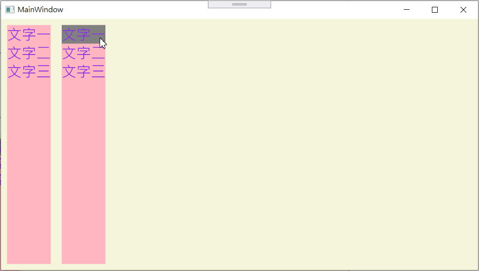
Trigger
Trigger主要的功能就是符合條件,觸發動作,可以符合不同狀況下,套用不同值,可用於Style內或者Template內,繼續之前的範例,加上Trigger,效果如下:
<!--第3層-->
<Style TargetType="TextBlock">
    <Setter Property="Foreground" Value="BlueViolet"/>
    <Setter Property="FontSize" Value="{DynamicResource FontsizeNormal}"/>
    <Style.Triggers>
        <!--滑鼠移入時,背景顏色為灰色-->
        <Trigger Property="IsMouseOver" Value="true">
            <Setter Property="Background" Value="Gray"/>
        </Trigger>
    </Style.Triggers>
</Style>
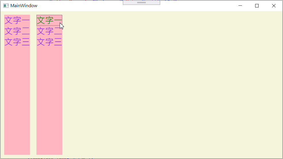
當然,也可以多個觸發條件,同時符合才會觸發動作,例如取得焦點和滑鼠移入同時發生時,文字變成綠色
<!--第3層-->
<Style TargetType="TextBlock">
    <Setter Property="Foreground" Value="BlueViolet"/>
    <Setter Property="FontSize" Value="{DynamicResource FontsizeNormal}"/>
    <Setter Property="Focusable" Value="True"/>
    <Style.Triggers>
        <MultiTrigger>
            <MultiTrigger.Conditions>
                <Condition Property="IsFocused" Value="True" />
                <Condition Property="IsMouseOver" Value="True" />
            </MultiTrigger.Conditions>
            <Setter Property="Foreground" Value="Green"/>
        </MultiTrigger>
    </Style.Triggers>
</Style>
以上介紹觸發條件的都以Property為主,但其實不只是UI控制項的屬性,也可以綁定其他屬性,自訂的亦可。另外上方的IsMouseOver感覺像是事件,事件另有EventTrigger可以用,針對UI控制項有的事件,不過事件觸發後,值就固定了,如果是MouseEnter變色,希望滑鼠離開變回來,就要再定義MouseLeave才行,並且EventTrigger需要定義動畫,很適合漸變效果。
<Style.Triggers>
    <EventTrigger RoutedEvent="MouseEnter">
        <EventTrigger.Actions>
            <BeginStoryboard>
                <Storyboard>
                    <ColorAnimation Duration="0:0:0.300" Storyboard.TargetProperty="(TextBlock.Foreground).(SolidColorBrush.Color)" From="BlueViolet" To="Red" />
                </Storyboard>
            </BeginStoryboard>
        </EventTrigger.Actions>
    </EventTrigger>
    <EventTrigger RoutedEvent="MouseLeave">
        <EventTrigger.Actions>
            <BeginStoryboard>
                <Storyboard>
                    <ColorAnimation Duration="0:0:0.300" Storyboard.TargetProperty="(TextBlock.Foreground).(SolidColorBrush.Color)" From="Red" To="BlueViolet" />
                </Storyboard>
            </BeginStoryboard>
        </EventTrigger.Actions>
    </EventTrigger>
</Style.Triggers>
參考

 木澤的研發腦
發表留言